The Power of Visual Communication
Bayer's World Geo-Graphic Atlas continues to encourage people to think differently about Geography.
Over 1800 visitors have engaged with Concept of a Visualist this summer and hardly a day goes by without a query about Bayer’s approach to the information he chose to include in the Atlas. Co-curator Benjamin Benus, author of Herbert Bayer’s World Geo-Graphic Atlas and Information Design at Midcentury is thrilled that the exhibit has elicited so many questions.
“It’s wonderful that people are raising these points. They’re exactly the kinds of conversations that Bayer hoped viewers would have,” he says.
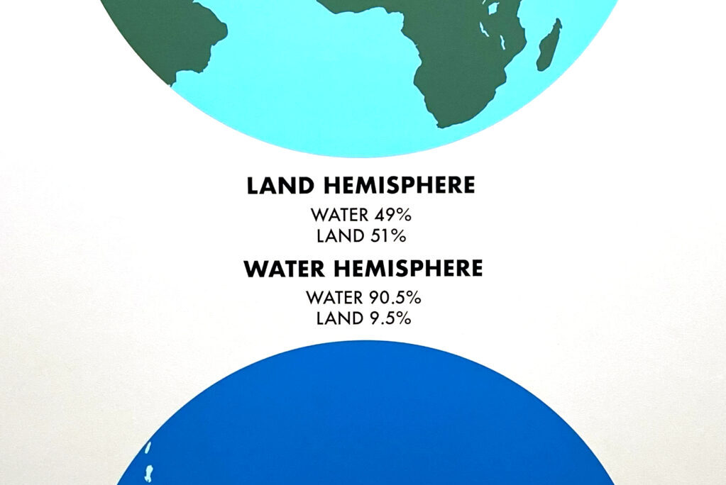
Recently, a visitor questioned if Bayer’s use of the word ‘hemisphere’ in this graphic might be a misnomer because the illustration does not relate to what most of us think of when we hear the term.
Typically, we use the word hemisphere to refer to the halves of the globe that are north and south of the equator or east and west of the prime meridian. But, says Benus, “you don’t need to halve the globe along these lines. In this particular case, Bayer chose to separate the half of the globe containing the most amount of land within it (which is still about 50% water) from the half that contains the least amount of land area (of which more than 90% is covered by water).”
While the graphic does not represent the hemisphere concept as we commonly use it, the Atlas itself was designed to encourage viewers to approach geography in unconventional ways. “After all,” says Benus, “why would it be any more logical to divide the globe east and west from Greenwich, England? Once geographers made that decision,” he continues, “we adopted it as the natural or objective way to think about world geography when, in reality, it’s just as artificial as any other division.” Ultimately, it is graphics such as this that illustrate the true power that designers have in shaping how we visualize and interpret information.
more


